 Website Design Goal
The goal of your website is to convert visitors into paying customers, and we can get you there. Just like your business, we know your web presence must be defined by the user experience — producing a compelling, accessible interaction where everyone benefits.
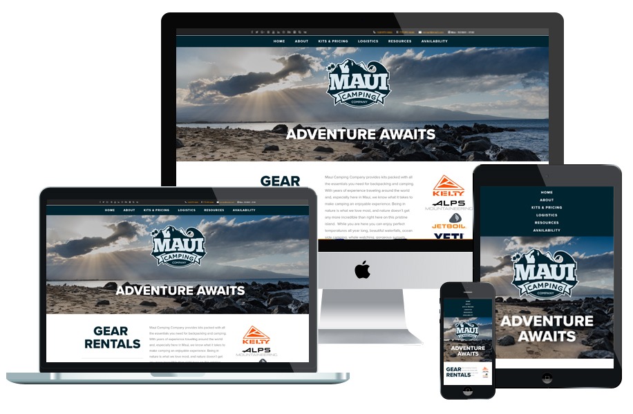
What is Responsive Web Design?
With responsive website design, your website (and its pages) can adapt and deliver the best experience to users, whether they’re on their desktop, laptop, tablet, or smartphone. For that to happen, though, your website needs a responsive design.
Responsive web design describes a web design approach that allows websites and pages to render (or display) on all devices and screen sizes by automatically adapting to the screen, whether it’s a desktop, laptop, tablet, or smartphone.
Is My Website Responsive?
If you have an existing website you can use a free tool, like Google’s Mobile-Friendly Test, to see if pages on your website are mobile-friendly.
Website Design Strategy
When devising a strategy for design, we keep 7 basic elements in mind:
- Structure: Reponsive design for great user experience across multiple devices and browers.
- Content: Compelling headlines, subheads, graphics and call-outs to reinforce key messaging.
- Usability: Consistent, user-friendly navigation and button interface.
- Appearance: Fresh fonts, graphics and color palette, tailored to your company’s target demographic.
- Accessibility: Creatively designed websites that meet Web Content Accessibility Guidelines (WCAG).
- Audience: Tailoring design to the target user expectations and aestgetic sensibilities.
- SEO: Best practices in code translate well into a visible, accessible and marketable website.

Contact Collier Design | Marketing today for a free consultation on your next project.